Mediamatic
El Hema
The project
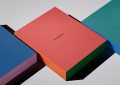
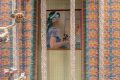
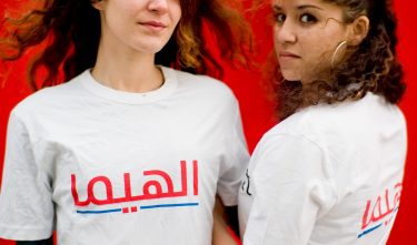
EL HEMA is an exhibition about five new Arabic typefaces, presented as an Arabic version of the well-known Dutch department store Hema: the EL HEMA. As an analogy for the typographic project, Mediamatic linked the Hema, as an icon of Dutch culture, with Arabic design. A new visual identity was developed for the EL HEMA exhibition, including a product line, comprising the cut-up-djelleba, Arabic T-shirts, Arabic chocolate letters and other items, and a restaurant.
Committee
Even though the visual identity is not particularly in- novative, this case is still noteworthy since it demonstrates that cultures can be brought together on the basis of a number of minimal adjustments to the Hema’s standard visual identity. The case demonstrates, as does that of Marhaba, that design can very effectively be used as a bridge between cultural differences. The jury believes that this side of design should be emphasized.
Jury
Although EL HEMA is not entirely applicable to this category (in the first instance the focus is on the introduction of five new Arabic typefaces rather than on the core visual identity of an organisation or business), the idea of integrating the applicability and the perception of these new fonts imaginatively with such a typically Dutch retail formula as the Hema is original, stimulating and daring. EL HEMA has been consistently executed in the form of a realistic and elegant exhibition in which a unique mix has been created between the existing visual identity of the Hema and the new Arabic fonts that have been developed by Arabic designers in close collaboration with Dutch typeface designers. A successful attempt has also been made to bring the Dutch and North African cultures closer together using an approachable and congenial medium.