Haico Beukers & Marga Scholma
Meyer van Schooten
The project
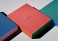
The corporate identity of Meyer and Van Schooten Architects is functional. The basis is the paper that is used: not printed paper, but paper with a large logo in ‘watermark’ (Customark). All external communications on paper are printed or copied on it; there are sheets in A4 and A3 format. There is no need to change the paper in the printer of the photocopier. A lot of attention has been paid to making templates for every conceivable application so that the house-style can be printed correctly from every work station. The watermark idea is applied in braille to items like business cards and reports, and to envelopes by printing on the inside.
Committee
A special feature of this house style that sets it apart is the out-sized logo which has been printed as a kind of watermark.