SVT Branding & Design Group
C1000

The project
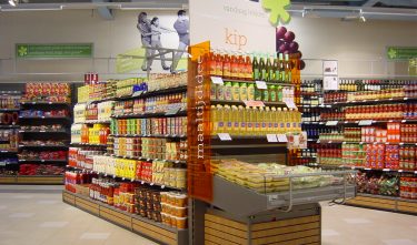
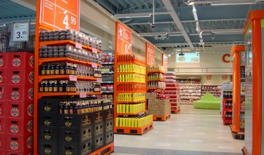
Now that the pricing war between supermarkets is slowly but surely coming to an end, it has become high time for C1000 to redefine its positioning. The ‘new generation’ C1000 supermarket is spacious, well organized and colorful. The consumer is pampered, surprised and inspired in every possible way in the new store concept. The communication in the store is kept simple, clear and unambiguous. The character of the graphical language employed is positive, cheerful and inspiring. The main colors of the new generation are orange, black and green. A new logo has been developed for the new stores that reflects strength, determination and modernity.
Committee
The design for the C1000 supermarket added quality to the retail experience without many ‘clever tricks,’ in line with the pricing proposition of this chain. A pleasant layout and the hanging lamps give an airiness to the daily shopping experience that feels natural. Despite the openness of the space and the perception of quality that this creates, the consumer is still made aware of C1000’s favourable prices so that the store is not experienced as ‘expensive’.