Flex/the Innovationlab
Specerijenflesjes Verstegen
The project
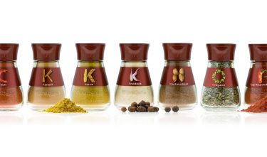
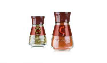
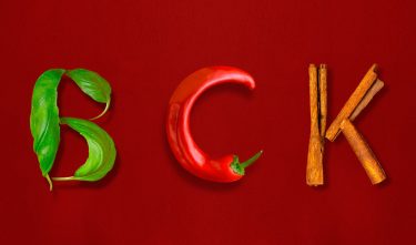
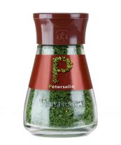
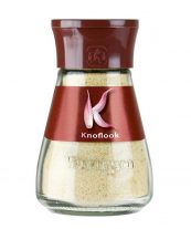
Party because of the economic crisis, designers in the packaging sector was permitted very little freedom or creativity in their design. Verstegen, the market leader for spices, nevertheless thought it could be worthwhile to upgrade the familiar spice rack. In this case, a brand agency and designes thought up a new type of packaging with ‘table value’. They developed a series of mills that are just as easy to find at home as they are in the shop because of the herb and spice alphabet: every pot has its own letter, starting with the A for Aniseed and ending with the Z for Zeezout (sea salt).
Committee
These bottled spices are easy to find on the store shelves and in the kitchen cabinet, because they are clearly labelled with a large capital letter for alphabetizing the spices from A to Z.