The Stone Twins
ONLY huisstijl
The project
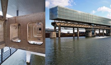
The Stone Twins were inspired by the Kraanspoor building for the design of the corporate identity of advertising agency ONLY, in which they are located. The steel and glass construction of the building, the concrete of the platform and the water can be picked up in ONLY’s house style. By giving the letter O a small hook, the O becomes a speech balloon, which seems to express that ONLY is involved with communication.
Committee
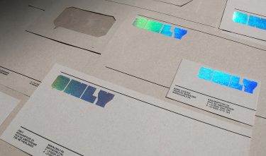
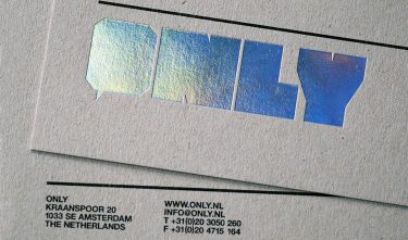
A new location should go hand in hand with a new corporate identity, is what ONLY advertising agency thought. In their design of a new corporate identity, The Stone Twins found inspiration in the new location. The logo printed in glossy foil reminds one of the water surrounding the location. The use of grey cardboard and the typography add an industrial touch to the correspondence.