Studio Joost Grootens
Dikke Van Dale

The project
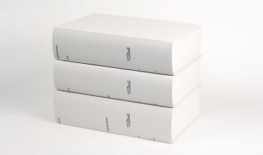
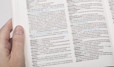
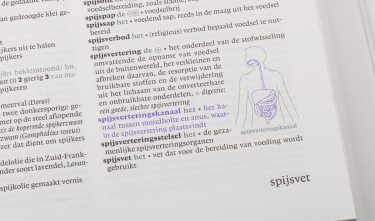
In 2015 the new Dikke Van Dale was published. This fifteenth edition (since 1864) counts 241,558 headwords on 4880 pages. A lot of time has gone into optimising the ease of use and clarity of the layout. To this end, one of the publisher’s traditions was dispensed with: the dictionary has for the first time been printed in four colours, contains illustrations, and got a new type face with a great selection of number and symbols.
Committee
In a digital era, Studio Joost Grootens managed to transform the paper Dikke Van Dale into a real ‘must have’. The designers took daring decisions and gave the Van Dale institute a light and contemporary appearance. A publication perfect down to the smallest detail: the committee believes that the result of this enormous project is design at its best.
Jury
This impressive project demonstrates the incredible dedication and immense focus that Joost Grootens brings to his designs. With the addition of colour and illustrations, he departs from long-held conventions and offers readers a new way to connect with the words. His subtle innovations have brought forth a user-friendly, contemporary edition. Not only for users, but also for the publisher: Grootens developed a technique to streamline the layout process of the expansive dictionary. Joost Grootens excels in reinterpreting books for the digital age.