Eden Design & Thonik
Gemeente Amsterdam

The project
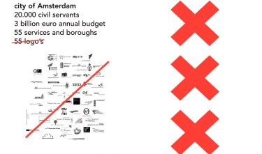
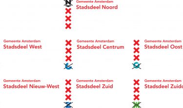
The City of Amsterdam wanted to clearly portray its identity to citizens, companies, and visitors. No other municipality in the Netherlands is as complex and fragmented as Amsterdam. Almost 60 different visual identities had to be consolidated into one clear and unambiguous style which would resonate with all those involved. A simple and clear house style was created, based on colour red and the three Andreas crosses from the city coat of arms. To keep the individual identities connected, Shape Alphabet was created, a system of shapes designed to be added to the three red Amsterdam crosses taken from the city’s 15th-century coat of arms. These shapes allowed the multiple organisations to create personal brand identities while ensuring the appearance of one unmistakable brand.