The Stone Twins
SoundCircus
The project
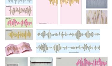
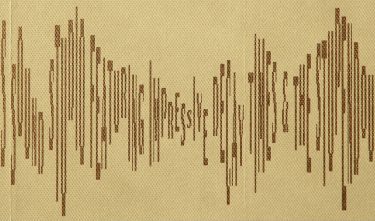
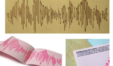
At first sight, they look like clear patterns of sound waves. When you look more closely, and hold the paper somewhat horizontal, these waves appear to be stylish typography. Slogans for various applications are rendered in circus and sound jargon, such as “THE WORLD FAMOUS SOUND STUDIO FEATURING IMPRESSIVE DECAY TIMES & THE STUPENDOUS STANDING WAVES”.
Committee
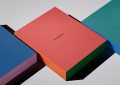
A corporate identity consisting of text fragments – but that is something you only find out at a later stage. Entertaining – a unique aspect for corporate identities – and rich despite the minimalist implementation.