BR-ND Mountain Design BV
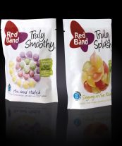
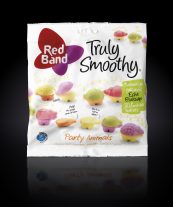
Truly
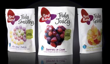
The project
Design, naming, photography, packaging material and copy for a new confectionery assortment, emphasizing the light and natural product and the social occasion of sweets.
Committee
This packaging has a fresh appearance and is innovative in the category, especially in view of the white background. The image language is consistent, and colour and logo are well tuned to each other. The use of material packaging with the look and feel of paper is appropriate for the concept and makes the whole consistent, appealing and attractive.